
In 2024, making sure your emails look good on any device is more important than ever. One key part of this is using the right email template sizes. This guide will show you the best dimensions for different parts of your emails, like the overall width and height, headers, content blocks, footers, and banners.
Using the right sizes helps your emails look neat and professional, no matter if your readers are on a smartphone, tablet, or computer. For example, the ideal width for most email templates is between 600 and 640 pixels on a desktop, which ensures your email won’t get cut off on the sides. On mobile, a width of about 320 pixels works best.
Headers, usually at the top of your email, should be around 70 to 150 pixels high to fit your logo and navigation links neatly. Content blocks, where your main message goes, should be kept between 800 and 1200 pixels in height to keep readers engaged without overwhelming them. Footers, often containing contact details and social media links, should be about 100 pixels high.
Banners, which are images or call-to-action buttons, should match the width of your email and be around 90 to 200 pixels in height. Knowing these dimensions helps you design emails that are easy to read and visually appealing, leading to better engagement and conversion rates.
This guide will walk you through these ideal dimensions and provide tips for creating the best email templates in 2024.
Understanding Ideal Email Template Widths

When designing your emails, one of the most crucial aspects to get right is the width of your template. In 2024, the standard width for email templates is between 600 and 640 pixels for desktop views. This size is widely accepted because it ensures that your email content fits nicely on most screens without getting cut off or looking squished. For instance, many brands like Wet n Wild use a width of 610 pixels to make sure their emails look clean and readable.
On mobile devices, however, the width needs to be much smaller to fit the narrow screens. A width of around 320 pixels is ideal for vertical mobile views. This allows your email to be easily readable without requiring the reader to scroll horizontally. For example, if you’re working on a custom email template design, you’d set this width to make sure your emails are mobile-friendly.
While you can go up to 800 pixels wide on desktops, it’s essential to test your emails on different devices to make sure they display correctly. Choosing the right width helps maintain a clean and professional appearance, making your emails more engaging and easier for your audience to interact with.
Best Email Sizes Breakdown
Finding the best sizes for different parts of your email can make a big difference in how your message is received. For instance, the width of your email is very important. Many marketers agree that 600 pixels is the best width for most emails.
This size works well because it fits nicely on most screens without getting cut off. If you want to go a bit wider, up to 800 pixels is usually still safe. For mobile devices, a width of 320 pixels is recommended, but you can go up to 480 pixels if your readers don’t mind turning their phones sideways.
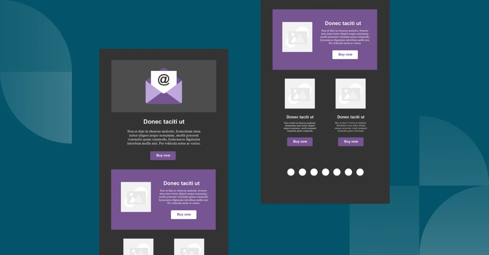
The height of your email can be more flexible. Typically, an email height of about 1500 pixels is a good target, but you can go up to 3000 pixels if needed. Just keep in mind that longer emails might not get read all the way through. For example, a promotional email with lots of product images might need more height, but a simple update or newsletter should stay shorter.
The weight, or file size, of your email is also key. Aim for an HTML email weight of 75 KB to ensure it loads quickly and doesn’t get cut off in email clients. Large images and GIFs can increase the weight, so compressing them is a good idea. For example, an image should ideally be around 200 KB, and a GIF should be no more than 1 MB.
Using these dimensions will help your emails look great and function well, leading to better engagement from your audience.
Optimizing Email Width for Any Device
When designing emails, getting the width right is crucial for readability and appearance. Most email designers agree that 600 pixels is the best width for desktop emails. This size fits well on most screens and ensures your content isn’t cut off or displayed incorrectly. If you want a bit more space, you can go up to 800 pixels, but this should be tested on various email clients to ensure compatibility.
For mobile devices, the recommended width is 320 pixels. This size fits perfectly on a vertical smartphone screen. However, if you go up to 480 pixels, users may need to turn their phones horizontally to see the entire email. Custom email template design can help in creating templates that automatically adjust to different screen sizes, ensuring a seamless experience for your audience.
For example, a company might use a 600-pixel wide template for their monthly newsletter. This ensures that images, text, and buttons are all clearly visible on both desktop and mobile devices. If they have a special promotion, they might use a wider 800-pixel template to include more product images and descriptions, but they would thoroughly test it across different platforms first.
By carefully choosing the width of your emails, you ensure that your content looks good on any device, providing a better experience for your readers and improving engagement.

Conclusion
In summary, finding the right email size is key to making your emails look good and work well on all devices. We’ve discussed the ideal dimensions for different parts of an email, such as the width, height, and various elements like headers, footers, and content blocks. By following these guidelines, you can ensure your emails are both attractive and functional.
For instance, using a width of 600 pixels for desktops and 320 pixels for mobile devices helps maintain a clean layout. Keeping the total height around 1500 pixels ensures your emails aren’t too long, which can prevent readers from losing interest. If your email includes images or GIFs, make sure they’re compressed to avoid long loading times.
A good example of an effective email design is a promotional campaign by an online store. They used a 600-pixel wide template for their desktop viewers and ensured that all important information was within the first 300 pixels in height. This made the email quick to load and easy to read. For mobile viewers, the template was adjusted to 320 pixels, keeping the layout neat and accessible.
By using a custom email template design, you can create templates that automatically adjust to different screen sizes and devices, making sure your content always looks its best. This approach not only improves the user experience but also increases engagement and conversion rates.
Following these best practices for email sizes will help you achieve better results in your email marketing campaigns in 2024.


")


