The dynamic world of restaurants has now evolved beyond the confines of physical spaces. An inviting and efficient website design has become an indispensable element that distinguishes a brand in the intensely competitive marketplace.
As consumers grow increasingly tech-savvy, it becomes imperative for businesses to remain at the forefront of design innovation.
Dive in as we explore the latest restaurant website design trends that are making waves and elevating user experiences.
Why Design Matters in Restaurant Websites
Consider that you chance upon a restaurant website that is a chaotic mix of colors, with visuals that fail to entice. It’s likely that you’d doubt the quality of the dining experience they offer.
Restaurant catering websites, much like a dining area, shapes the visitor’s first impression. An aesthetically pleasing and well-structured design doesn’t just encapsulate the brand’s ethos and ambiance. It also acts as a prelude to the culinary journey that the restaurant promises.
In this digital era, the website embodies the restaurant’s brand. Its design should resonate with the restaurant’s values and tantalize the visitor’s palate even before they set foot in the establishment.
Trending Now: Top Design Elements for Restaurant Websites
The digital landscape, particularly in web design, is in perpetual flux. Here are some of the most compelling design trends that are defining modern restaurant websites:
- Embracing Minimalism: A simplified layout, characterized by ample white space, clean lines, and legible typography, is in vogue. By eliminating superfluous elements, restaurants are offering a user-centric online experience, spotlighting their prime offerings.
- Power of Typography: Custom fonts and expressive typography have taken center stage. From refined scripts to impactful headlines, typography is being leveraged to strengthen brand narratives.
- Colorful Interfaces: Vibrant color palettes and gradients are being employed to evoke specific emotions. A strategically chosen color scheme can render a website memorable and align it with the restaurant’s persona.
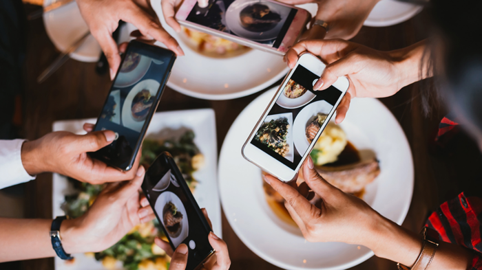
- Photography Takes the Lead: High-quality, authentic photographs, showcasing mouth-watering dishes and the restaurant’s ambiance, can transport users and whet their appetite.
- Mobile-First Approach: Given the ubiquity of smartphones, it’s indispensable for restaurant websites to be optimized for mobile. A responsive design ensures an uninterrupted user experience, irrespective of the device used3.
10 Design Trends on Their Way Out

-
Overwhelming Animations:
-
-
- Why They Were Popular: Animation can bring life to a website and enhance user engagement, making the overall experience dynamic and interactive.
- Why They’re Fading: An overuse or misuse of animations can be distracting, detract from the main content, and potentially slow down site performance.
-
-
Complex Menu Structures:
-
-
- Why They Were Popular: Detailed menus were once seen as a way to provide users with a plethora of options and insights into a website’s offerings.
- Why They’re Fading: Users crave simplicity. Overcomplicated menus can be confusing and often deter visitors from exploring further.
-
-
Flash Intros:
-
-
- Why They Were Popular: Flash intros offered a multimedia experience and were considered the pinnacle of website innovation in the early 2000s.
- Why They’re Fading: They pose compatibility issues, especially with mobile devices. Additionally, they can hurt SEO, leading to decreased site visibility.
-
-
Stock Images:
-
-
- Why They Were Popular: They provided an easy solution for businesses to visually represent their brand without investing in custom photoshoots.
- Why They’re Fading: Overused stock photos can feel inauthentic and generic. Brands are now looking for original and unique imagery.
-
-
Autoplay Videos:
-
-
- Why They Were Popular: They caught the visitor’s attention immediately and could convey a message quickly.
- Why They’re Fading: Autoplay can be intrusive and disruptive, often leading to a higher bounce rate.
-
-
Skeuomorphic Design:
-
-
- Why They Were Popular: It provided familiar and tangible designs by mimicking real-world objects.
- Why They’re Fading: The design community has shifted towards more minimalist and flat designs.
-
-
Parallax Scrolling:

-
-
- Why They Were Popular: It provided a sense of depth and dynamism to web pages.
- Why They’re Fading: When overused, it can be disorienting for users and potentially harm website performance.
-
-
Infinite Scrolling:
-
-
- Why They Were Popular: It allowed users to continually browse without having to click on the next page.
- Why They’re Fading: It can be frustrating if users want to reach the footer or if they lose their place on the page.
-
-
Heavy Pop-ups:
-
-
- Why They Were Popular: They ensured that the visitor saw an important message or promotion.
- Why They’re Fading: They can be annoying to users, especially if difficult to close or if they appear too frequently.
-
-
Desktop-first Designs:
-
- Why They Were Popular: Desktop was the primary browsing device for many years.
- Why They’re Fading: With the rise of mobile browsing, designing with a mobile-first approach has become the new standard.
Recognizing and adapting to the ebb and flow of design trends ensures that designers and brands stay relevant, providing users with the best possible experience.
Local SEO and Online Ordering Integration
Optimizing a restaurant’s website for local search engine optimization (SEO) is a game-changer in the digital age. It ensures that nearby customers can easily find and engage with the restaurant online. By incorporating location-specific keywords, meta tags, and schema markup, the website becomes more discoverable to local searchers. This strategy not only attracts potential diners but also improves the restaurant’s visibility on platforms like Google Maps.
Moreover, the integration of online ordering and reservation systems directly into the website streamlines the customer experience. It allows patrons to browse the menu, place orders, and make reservations seamlessly. This convenience not only satisfies tech-savvy customers but also enhances operational efficiency by reducing the need for manual order processing. A user-friendly interface for online orders and reservations can be a significant competitive advantage.
User-Generated Content and Reviews
User-generated content, particularly customer reviews and photos, serves as a potent tool for building trust and credibility. By showcasing authentic experiences and feedback from previous diners, restaurants can instill confidence in potential customers. Positive reviews and enticing food images can influence decisions, making visitors more likely to choose the restaurant for their dining experience.
Engaging with customer feedback, both positive and constructive, is equally crucial. It demonstrates the restaurant’s commitment to customer satisfaction and shows a willingness to improve. Addressing customer concerns and thanking them for positive reviews fosters a sense of community and loyalty. This proactive approach not only enhances the restaurant’s online reputation but also contributes to its long-term success.
Conclusion
A restaurant’s website is more than just a digital representation—it’s an immersive experience.
By incorporating modern design trends and emphasizing user-centric features, restaurants can weave a compelling digital narrative. Yet, the journey is continuous.
Prioritizing evolving user preferences, focusing on design efficacy, and remaining receptive to new trends will steer a restaurant towards lasting digital success.
Let your website be the enticing appetizer to the main course of delectable dining experiences.

