You want your website to look nice and convey an easy-to-understand message. If you can do this, your audience will feel engaged and more likely to return to your site. However, you can’t achieve this without knowing the web design basics.
There are five web design fundamentals that everyone should know. Once you understand them and include them on your site, you’ll notice a huge difference! Everything you need to know is in this article, so keep reading.
1. Set a Strong Intent

First, you want to make sure your website has a strong purpose. Viewers should know what your intention is after opening the site. Every website can have a different intent, but you’ll still want to know how to convey that to your viewers.
There are four everyday purposes for business-to-business websites. These include:
- Selling products or services
- Building a reputation
- Gathering leads
- Boosting sales
If you’re building your site for a brand, it should have one of those four intents. A successful website communicates quickly with your audience, so you’ll need to have a purpose in mind before you start designing.
Going in without a plan will make your website look disorganized and confusing. Overall, you should always set a strong intent first.
2. Keep It Simple
You want your website to be simple and consistent. That means using the same color schemes, visuals, and text fonts throughout the site. If you combine too many complex elements, visitors won’t know where to look or click.
In many types of design, simple is best- you want to focus on the visitor’s experience. Let’s break down a few ways to keep your site simple and appealing!
Make a Color Palette

Many designers recommend using less than five colors for your site’s core color scheme. You can start by choosing three colors and use the 60/30/10 rule to apply them to your site. This rule states that you should split the colors you use up like this:
- 60% should be for the primary color
- 30% should be for the secondary color
- 10% should be for the accent color
If you’re having trouble choosing your colors, use a primary and secondary pigment. The accent color should stand out, but you use it sparingly for a better impact.
Use Consistent Text
Next, make sure you use consistent text fonts throughout the site. Typography is an essential element of web design, so you’ll want to practice it.
As a general rule, you shouldn’t include more than three different font styles on your website. Plus, you need to ensure all of the fonts are legible.
Visuals Showcase Brand Identity

No matter your site’s main purpose, you should always use it to showcase your brand identity. Visuals play a huge role in making a personality for your website.
All images, including graphics, videos, and photos, should have a consistent style. A web designing company like thecreativemomentum.com can help you with creating the impression that comes from the visuals and layout to create a good impression. You want all of your visuals to be high-quality because of this!
3. Easy Site Navigation

Next, you want to make sure that your website is easy to navigate. That means it’s simple for visitors to find what they want. If you have lousy navigation, then the website’s retention abilities drop drastically. People tend to give up quickly when they can’t find what they’re looking for right away.
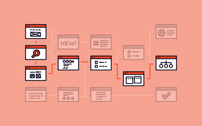
Keep your navigation straightforward by making plenty of menus and areas to click. All web pages should connect naturally, so they’re easier to find.
Overall, you want your navigation to be intuitive. You can ask a friend to click around your website and see what they think. If they have trouble finding certain pages or information, you’ll want to make sure you make changes!
4. Noticeable Visual Hierarchy
Your site needs to have a visual hierarchy since it’s one of the most important factors in making a quality website. It’s the fundamental principle of arranging your site to show importance. For example, more essential elements tend to be larger than less important ones, drawing our eyes to them naturally.
Start by creating a focal point to show your visitors where to find the most critical information. Then, build off that focal point in descending order. You’ll need to consider negative space, typography size, contrast, and placement with your visuals.
In short, a visual hierarchy establishes the order in your website’s design. Your site can have more impact on how you lay out your site using this principle!
Consider a Grid Structure

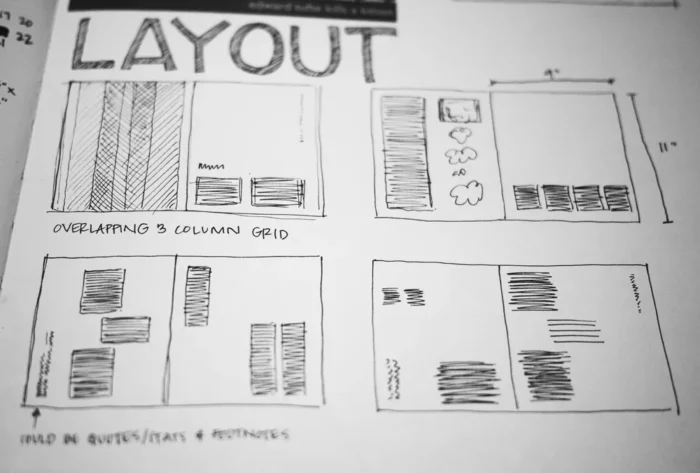
You can easily achieve visual hierarchy by using a grid structure to build your site. Create a simple grid, then use it as a guide to align various elements on the page. You can use columns and rows to make everything organized.
Having a proper structure to your site makes it much more pleasing to look at, so your visitors will stick around longer.
5. Make It Mobile Friendly

It’s also essential that mobile users can easily access your website. More people than ever before are using their smartphones to browse the internet. If your site doesn’t load for them, you miss out on a vast audience.
Always test your site on real mobile devices. You won’t get a good feel for it unless you frequently check on it with your smartphone. It’s also essential that you put a lot of your focus into making the layout very responsive.
Implementing a responsive layout means the website can scale itself to the size of the screen visitors use to view it. The site should look good to those using large or small screens. Plus, having a mobile-friendly site makes it go up in Google’s SEO rankings!
Overall, you want to make your site mobile-friendly. You should check on responsiveness throughout the entire design process.
Update Your Sites Often
Checking your websites and making adjustments gives you essential practice in working with these important web design fundamentals. As long as you focus on creating a simple and easy-to-use website, you’ll see success! Read more on web design companies Bay Area.


